Designing the Trust Layer for Autonomous Commerce.
With 73% consumers now use AI in their shopping journey. AI agents are starting to shop on behalf of users. They browse, compare, and purchase across merchants. But checkout is currently is breaking context and drop off occurs when consumers are redirected.
Role: Design lead
I led agentic checkout, owned checkout strategy, Defined trust framework, Identified return member gaps, codified presentment principles, cross functional alignment, collaborated with 6+ partners
Team: Product manager | Content designer | Researcher | Engineering team | Partnership teams
Strategy & Roadmap | Cross-functional alignment with partnerships | Product Design | Visual Design
AI shopping is here, PayPal risks becoming just a button
Increasingly, people are using AI as part of their shopping journey. Agents can now suggest the right product and complete checkout.
For PayPal, this is a new revenue channel. But customers don't yet trust AI agents with their payment — which risks customers not checking out at all.
My role was to define how PayPal earns buyer confidence in this new agent context.
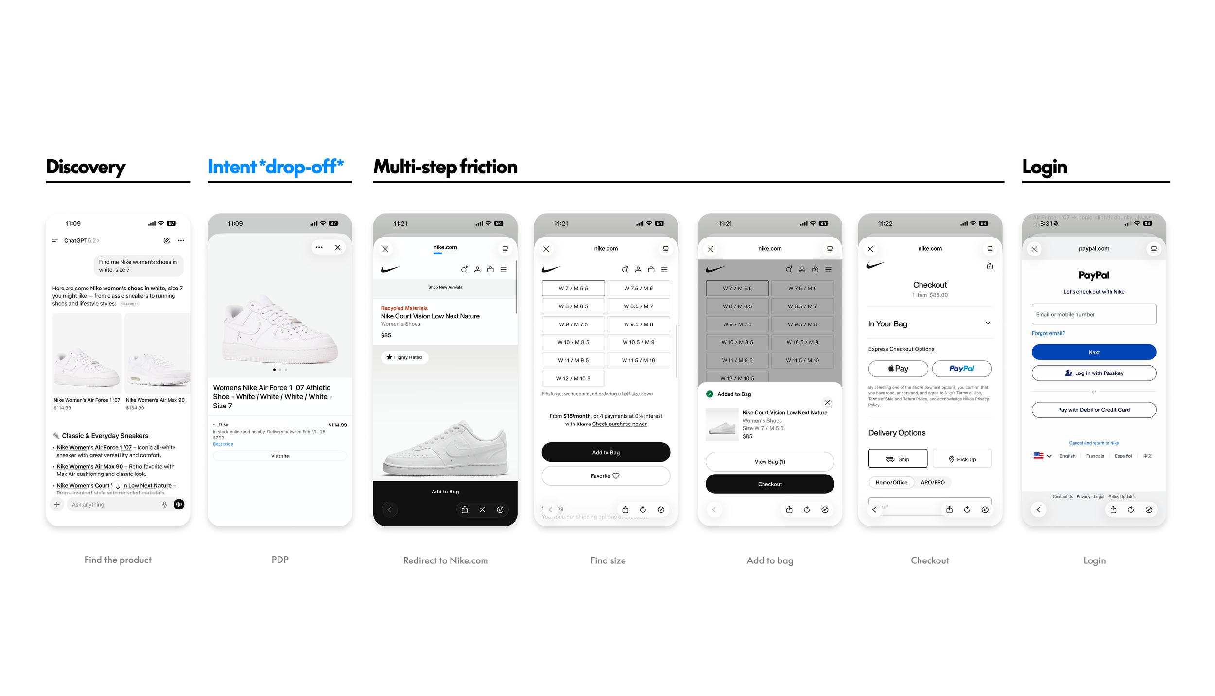
Problem: Checkout should not be the most tedious step.
Key Metrics
Must wins:
Branded TPV from agentic channels
Number of Branded Checkout transactions
Transaction margin (Member vs. Guest mix)
Leading:
Branded Member presentment rate
Branded Member selection rate
Member vs. Guest mix
Initial Hypothesis
By keeping users in-context, we will help reduce context break and make the experience more seamless, increase conversion, and reduce drop-off.
Conversation recommendations might feel untrustworthy. “How did they know my information?”
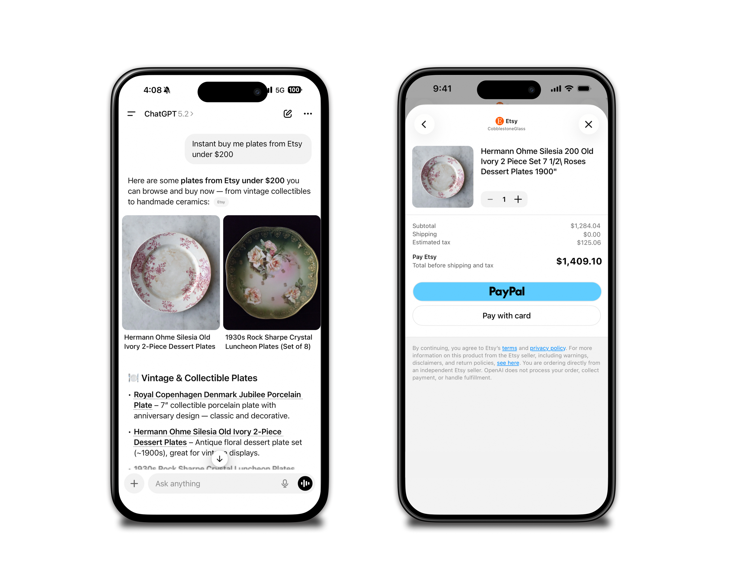
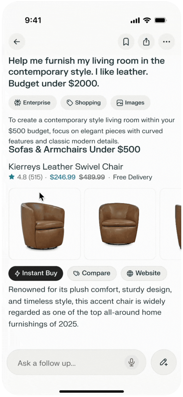
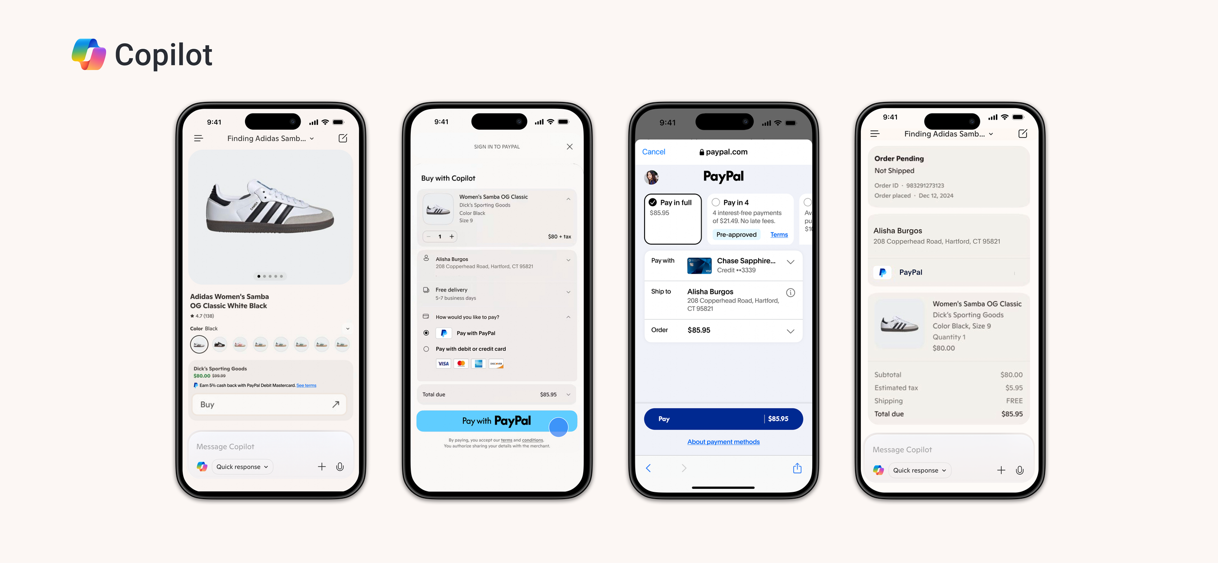
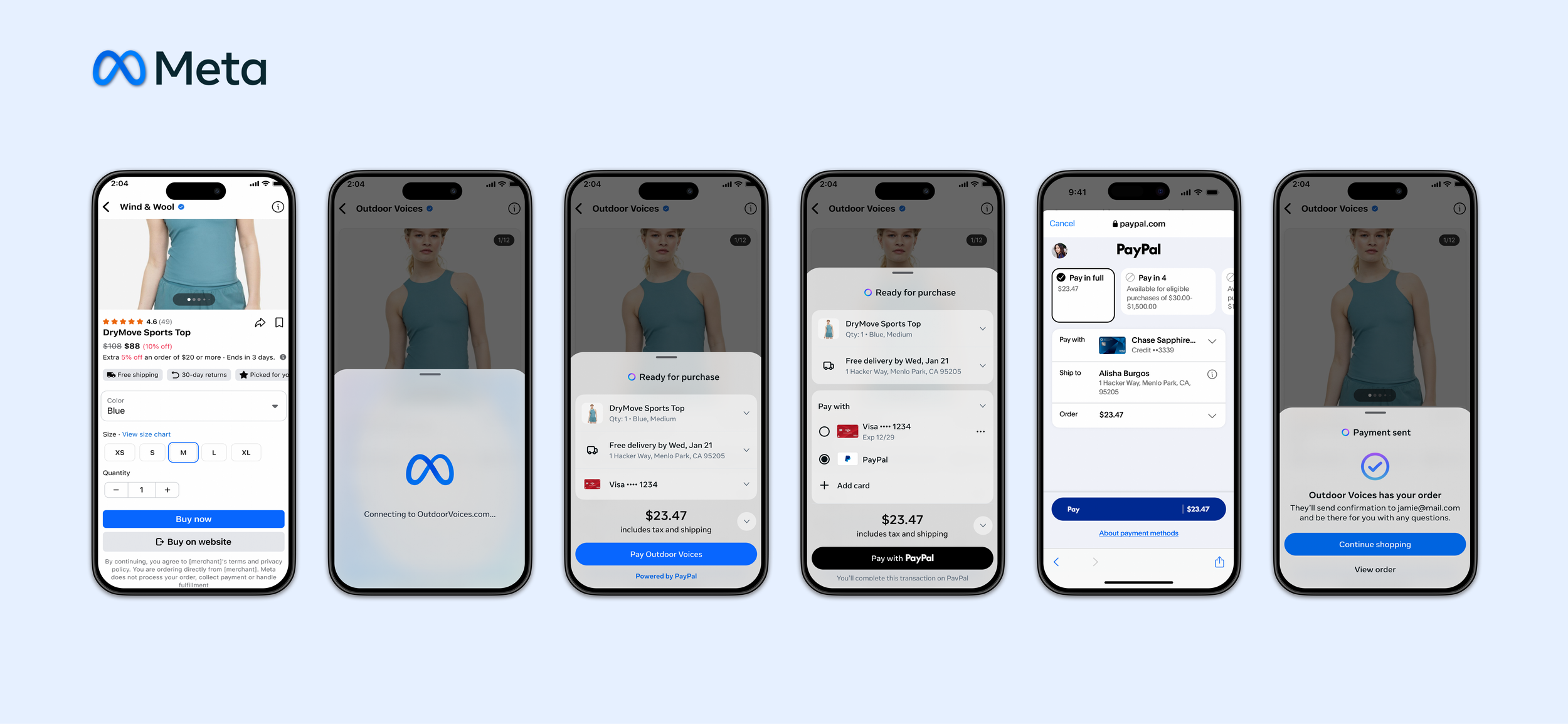
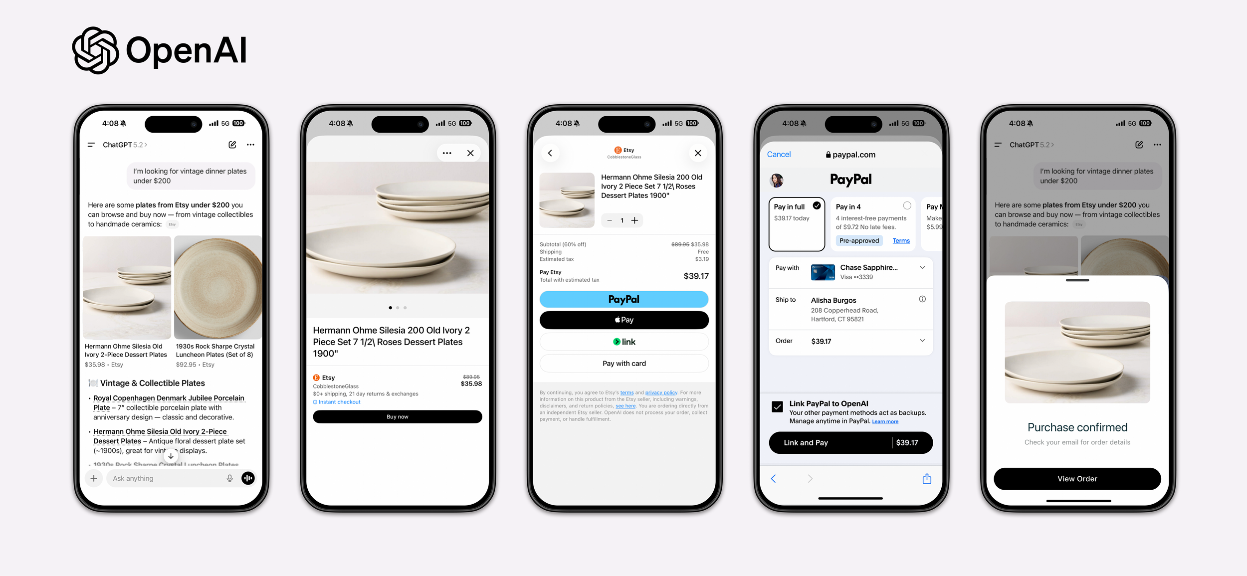
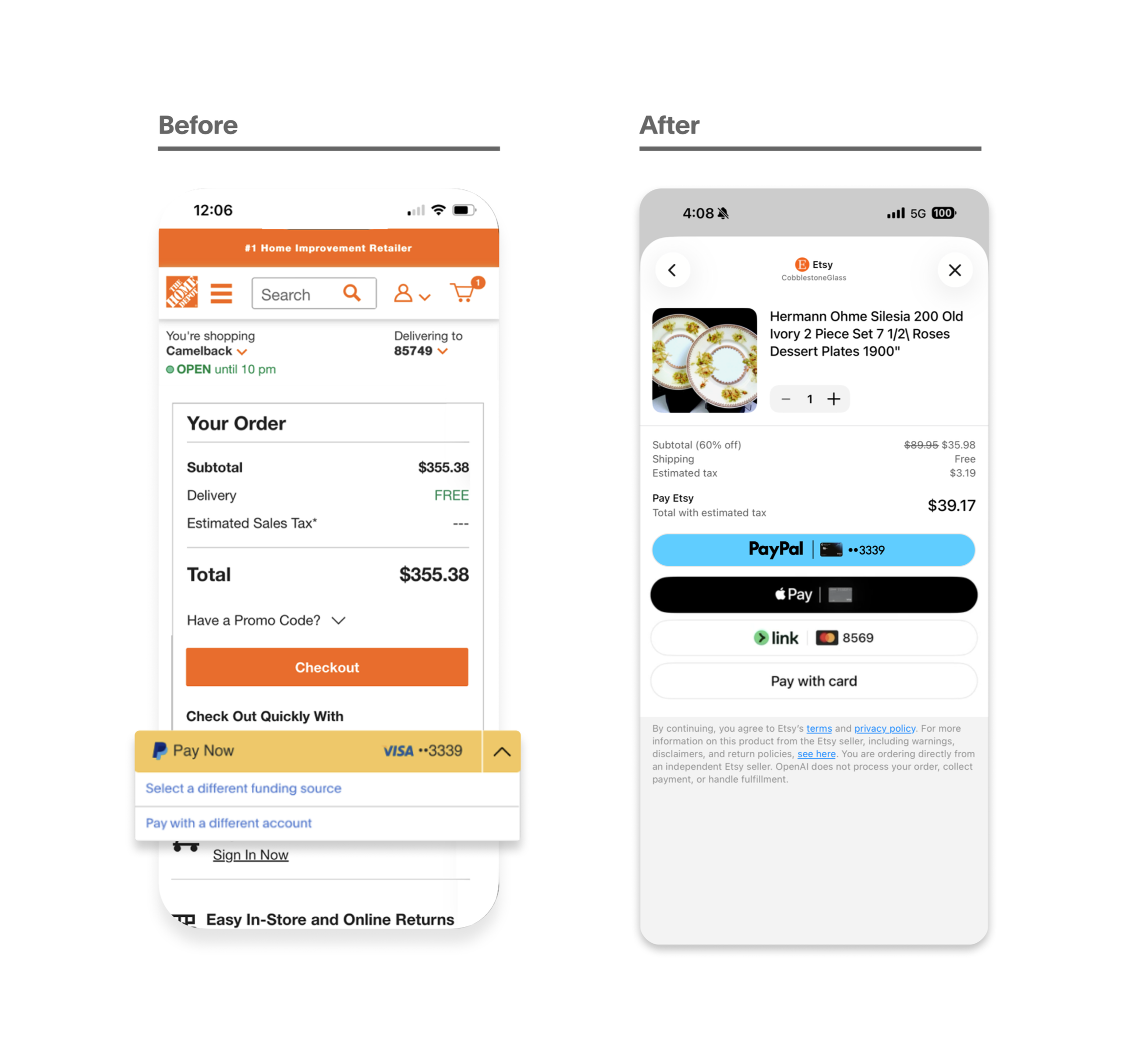
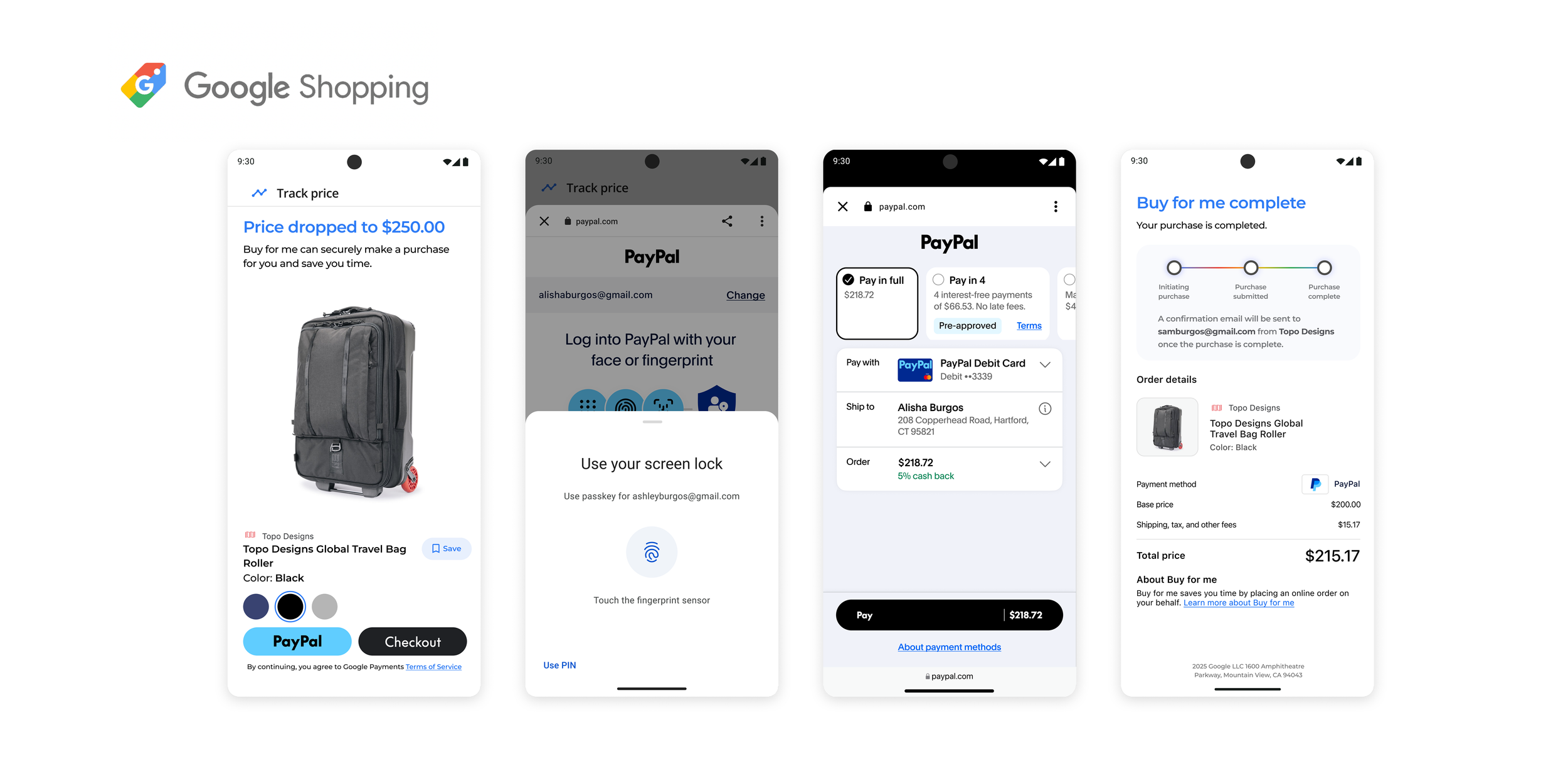
Inline Checkout
I started with the known user pain: in an agentic flow checkout is being redirected. My initial instinct was inline checkout, embed PayPal directly inside the agent's interface. No redirect. Fewer steps, less drop-off, higher conversion.
Different exploration of how something similar to the existing PayPal paysheet can appear in context.
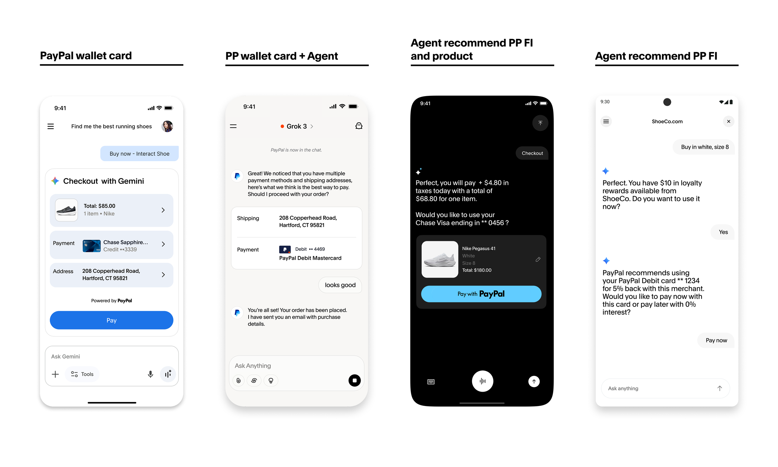
Seamless inline wallet/card recommendations
Elegant solution failed
Two blockers killed it.
Technical: PayPal's auth requires a login redirect that couldn't be embedded in third-party agent UIs.
Psychological: users didn't want to enter credentials inside an unfamiliar interface.
“It's a bit creepy. How does the AI know so much about my card information?
I think it's nice to have everything in conversation, but it makes me feel like I have to be even more cautious now.” -Rob, 35 · Online shopper · Frequent AI user
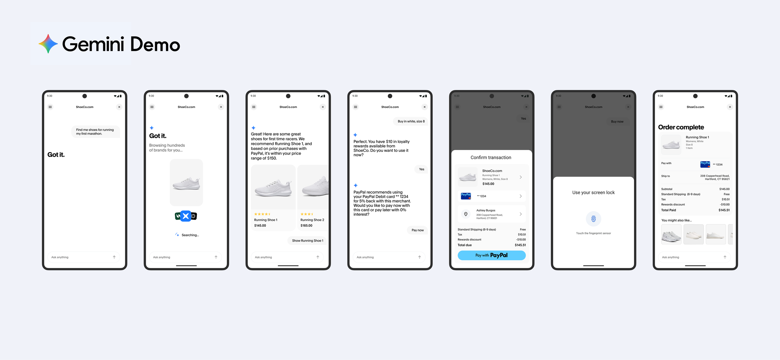
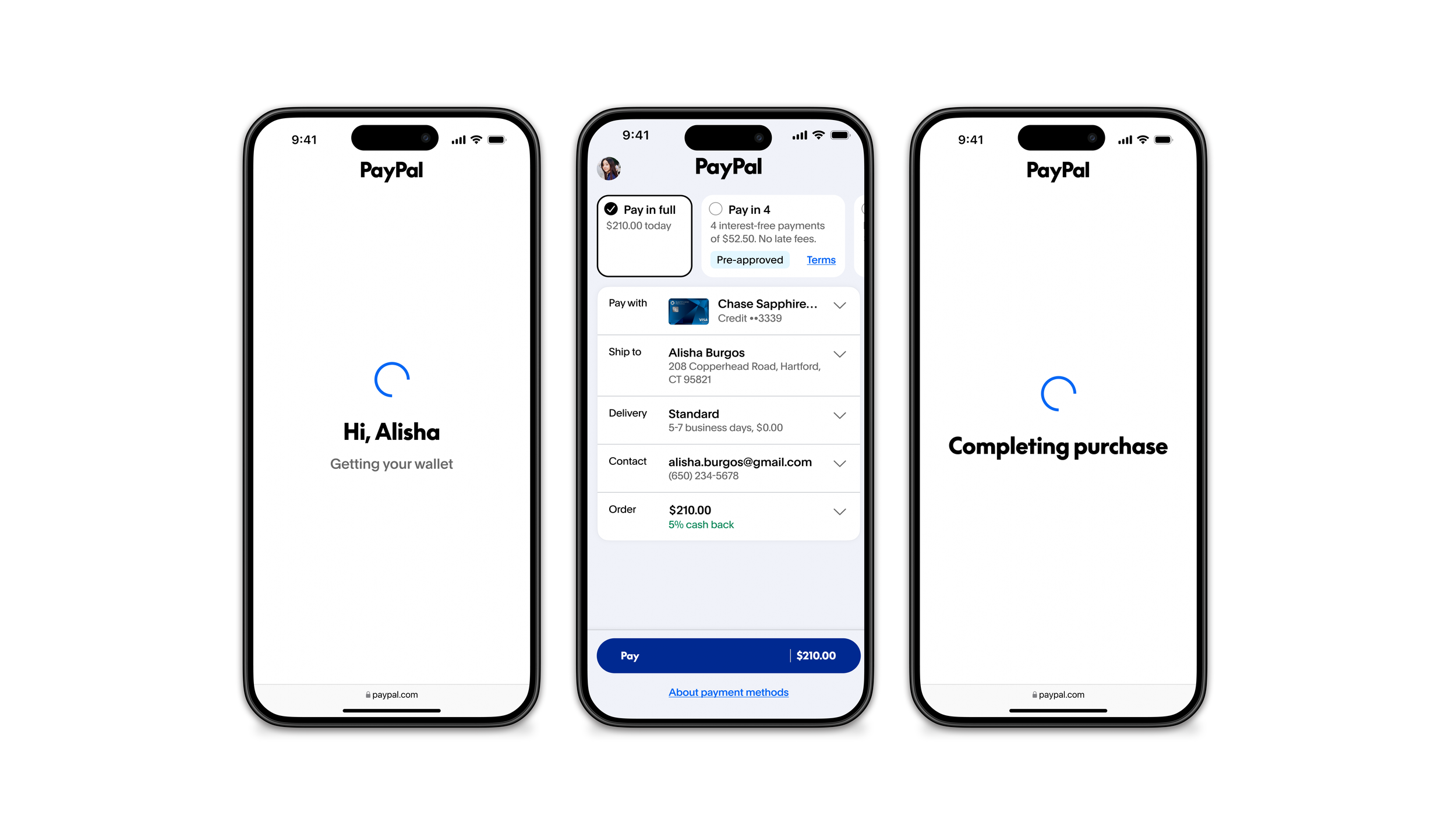
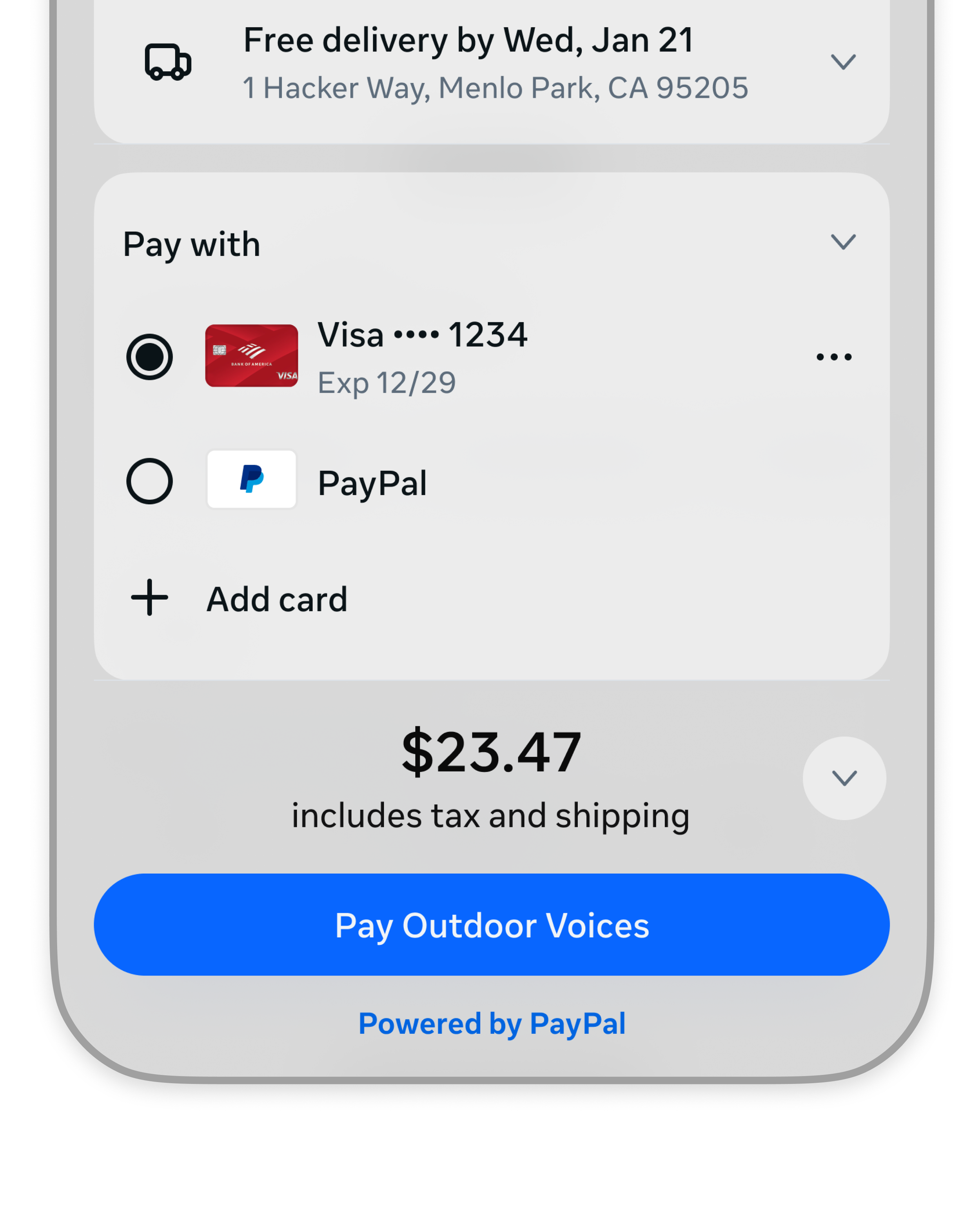
The pivot: A Trust System
I started with the familiar paysheet from traditional checkout. Instead of building new components, I took existing elements that were already earning trust.
I reframed the redirect as a feature, not a bug, and designed a trust system around the standard checkout flow. Instead of eliminating steps, I made every step build confidence.
What I Owned
I owned PayPal's presence and experience from the moment where purchase intent peaks through the end of checkout.
Consumers are 54% more likely to purchase when PayPal is visible.
Because every partner integration is a negotiation: how much of PayPal's brand and behavior lives on their surface versus ours. My job was figuring out where to hold the line and where to flex
The issue with presentment
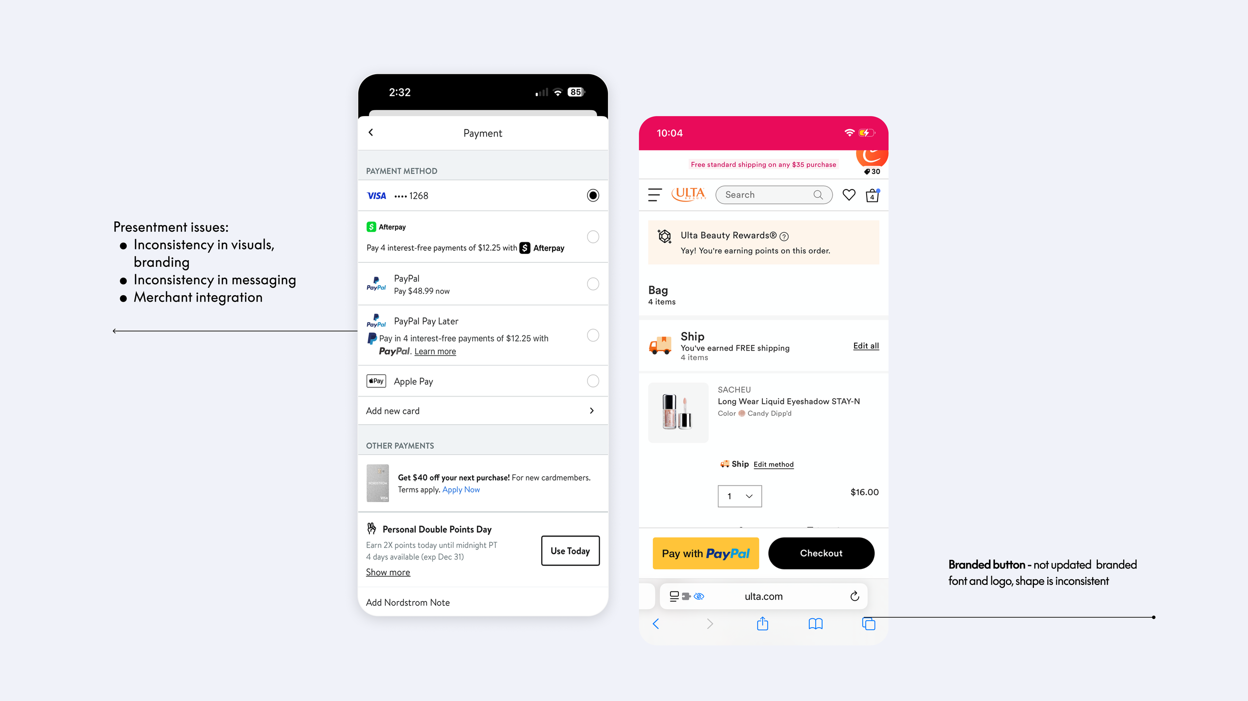
Trade-off between partner design systems vs PayPal visibility
Inconsistent Presentment
Trade-off between partner design systems vs PayPal visibility
Inconsistent Presentment
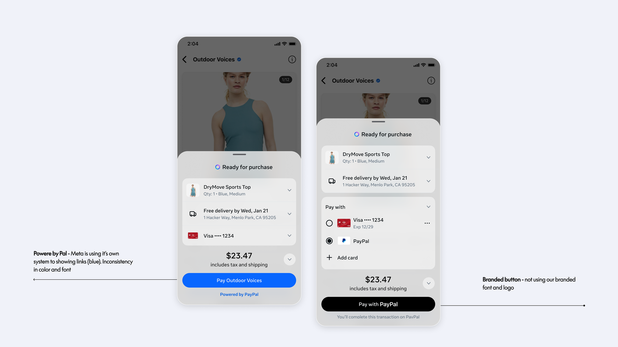
Trade-off between partner design systems vs PayPal visibility
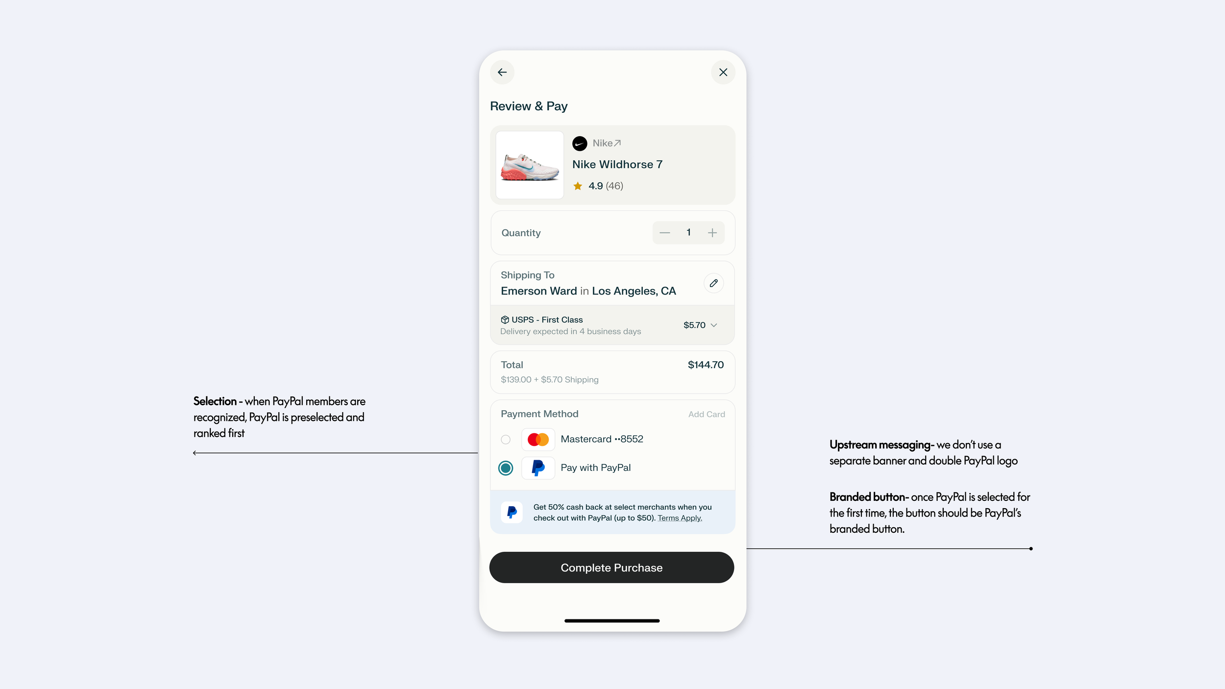
Consistent Presentment
Regardless of the entry, checkout experience mirrors the paysheet users already know. Same layout, same interactions, same sense of control.
In an unfamiliar agentic context, familiarity is a deliberate trust anchor.
Ways we might increase Buyer Confidence
I owned three layers that I identified as ways we might increase purchase confidence.
Buyer confidence
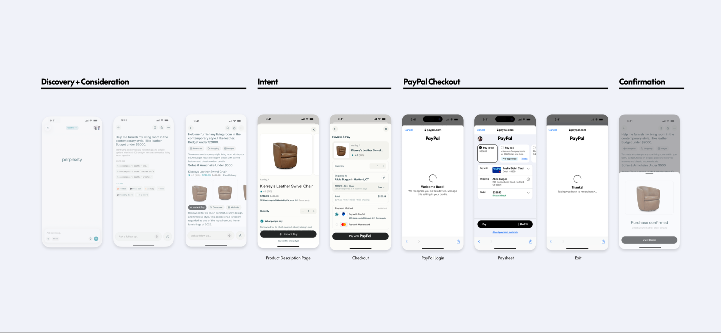
By having consistent presentment through Perplexity’s shopping journey, PayPal served as a trusted signal in a new shopping environement.
The trade
Perplexity wanted 'Powered by PayPal' in their typography and color.
The alternative was spend more time fighting for typography and color, risking that Powered by PayPal get cut entirely.
I decided that for the intial launch, visibility on every guest transaction was the real win but I prefaced this as something I would want to test into.
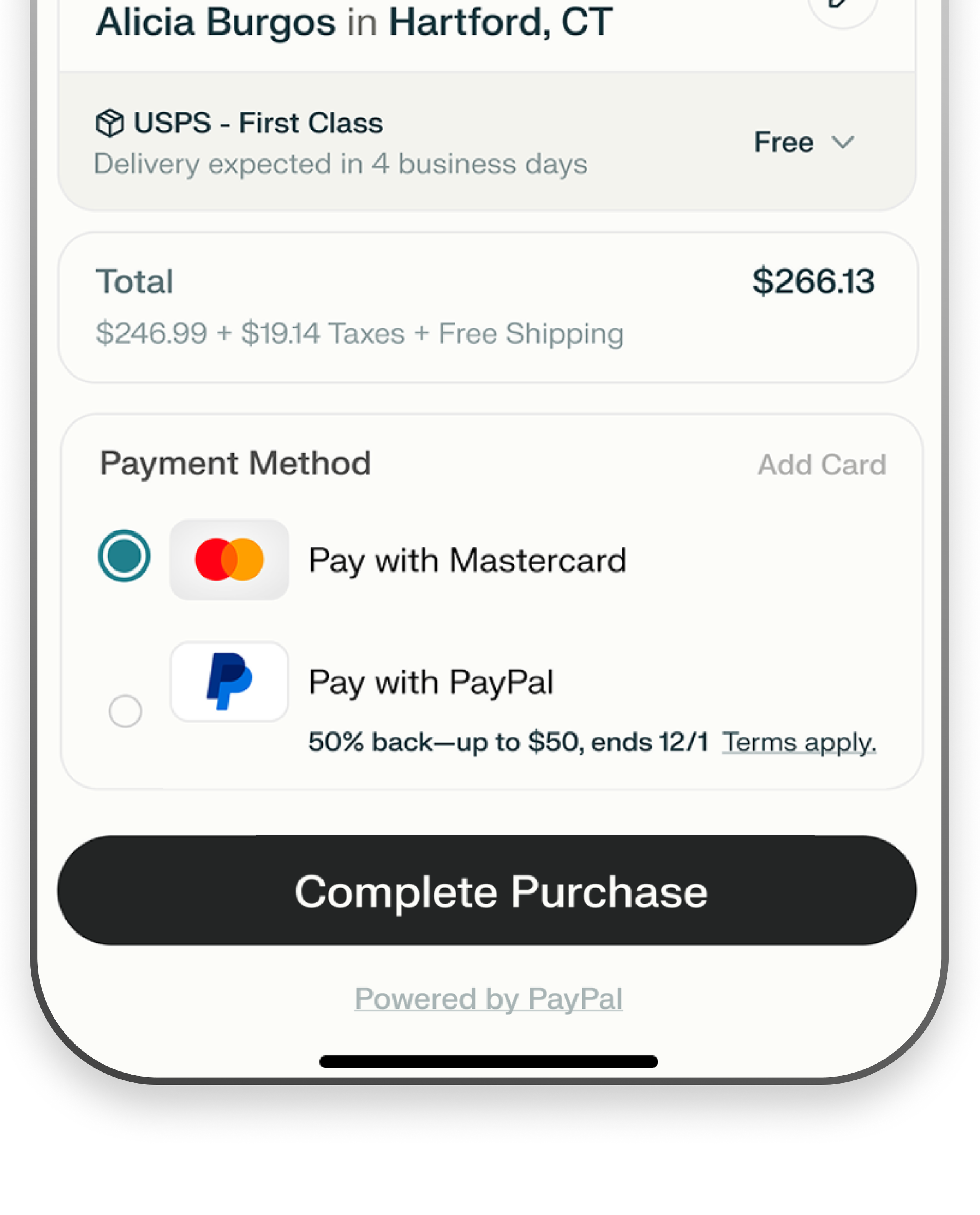
Upstream messaging, payment selection, button consistency, standard paysheet
The result we got from Perplexity was 99% conversion overall, but 70% of add-to-cart users never clicked the checkout button.
UXR: PayPal visibility was the reassurance that made customers checkout. PayPal need to dial up its trust signal.
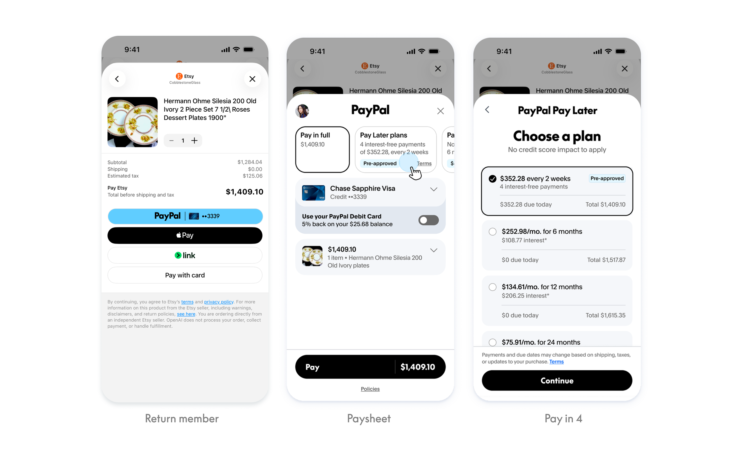
Return members
Checkout was successful with a 99% completion rate — payment was doing its job. But 70% of customers who added to cart never clicked the checkout button. The issue was upstream, validating my hypothesis.
Research also called out that confidence takes time to build.
Instead of hammering on the 70%, focus on the 30% who already came through.
Let's perfect the return experience so those customers stay, while first-time trust builds over time.
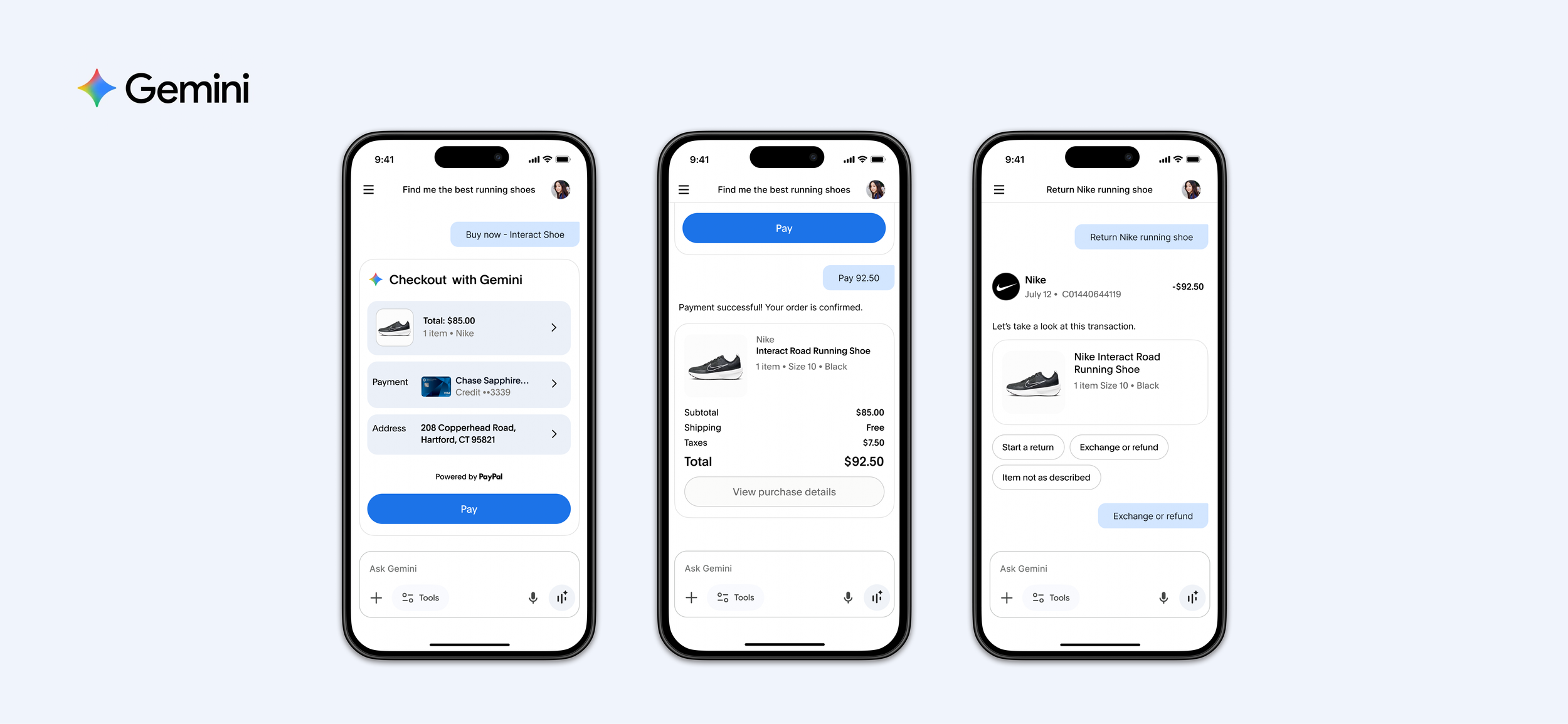
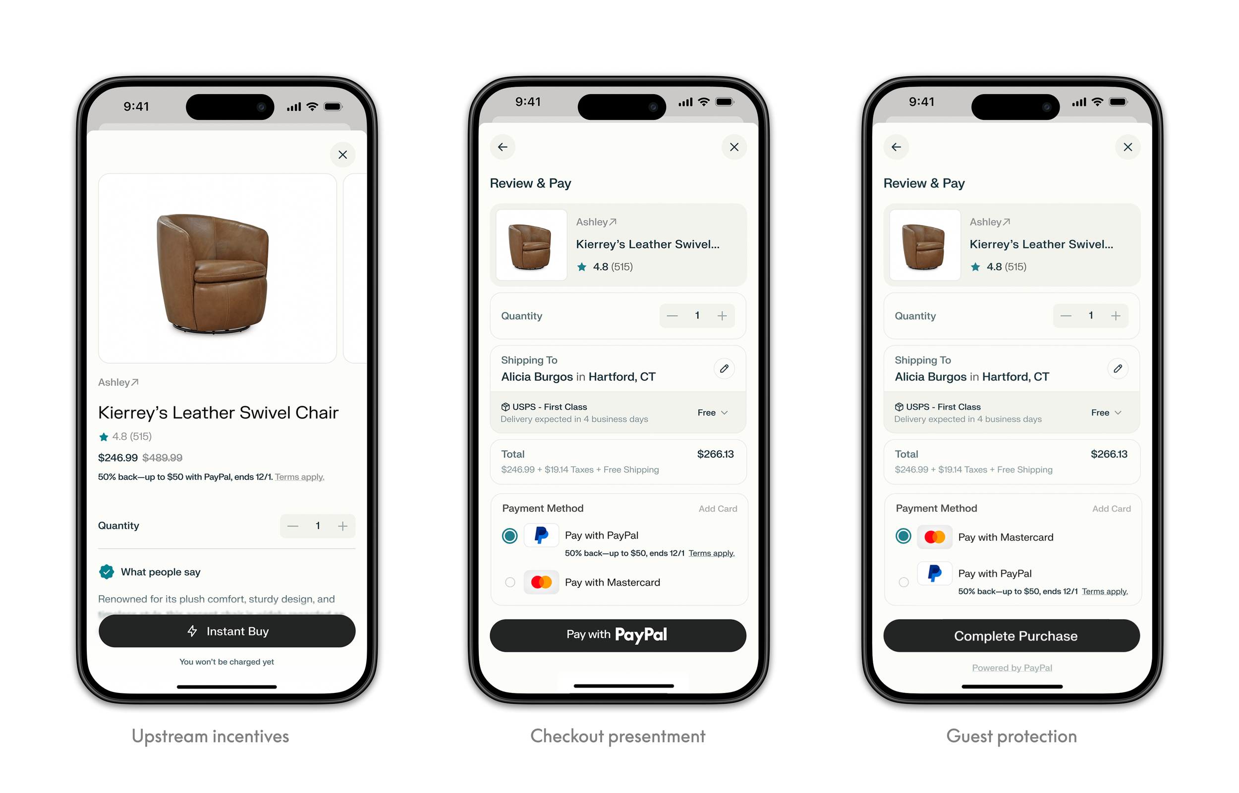
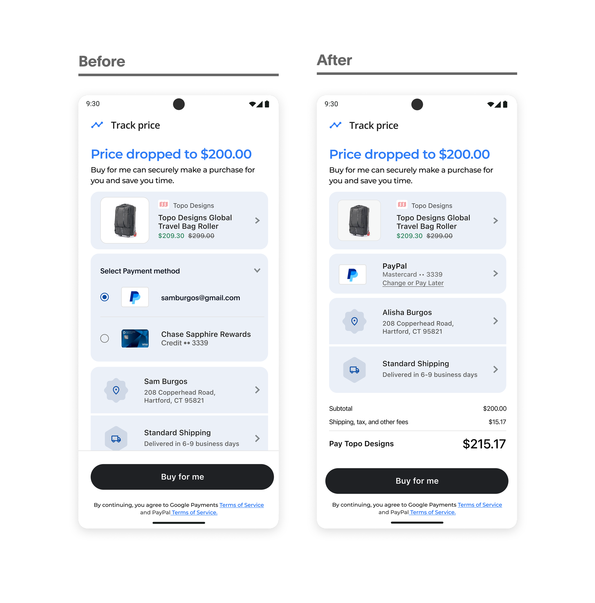
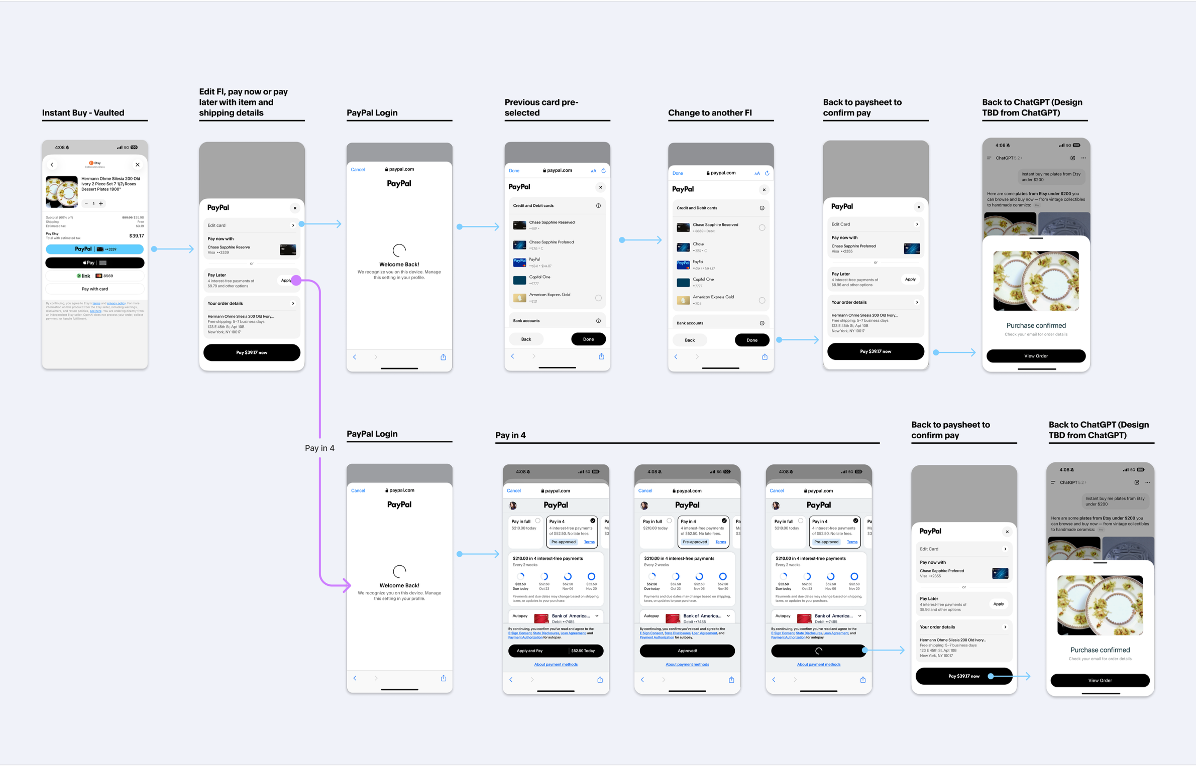
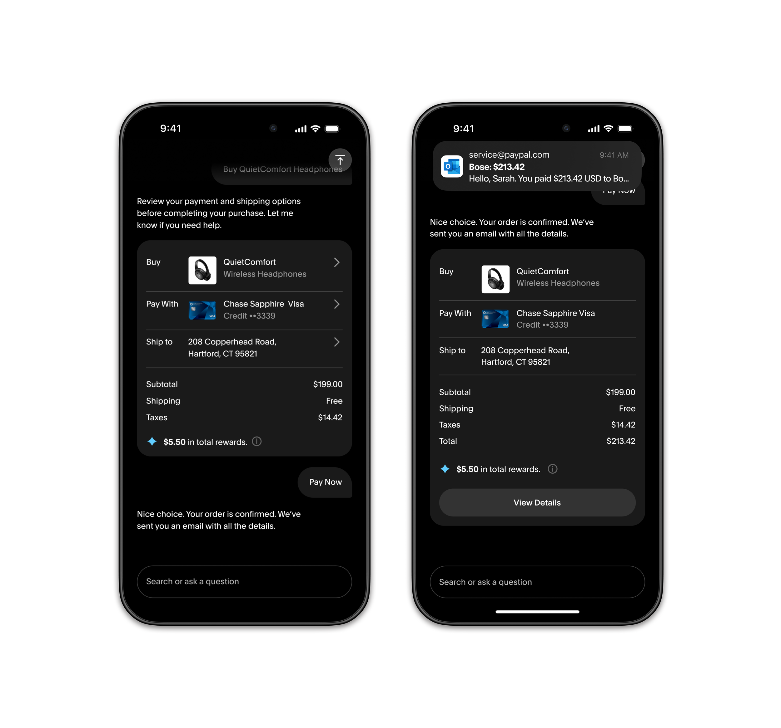
Similarly, this applied to return buttons. Vaulted buttons remain a existing checkout issue even outside of agentic checkout.
Add Link PayPal to <Platform>
Create an additional step for more control
Return members vaulted button
Unlike the radio, PayPal had actually built a way to surface more information on the linked button.
Customers have the ability to change their payment, change their account (which doesn't get much usage) — all inside of a dropdown on the side of the button.
But nobody finds it. The hit area is tiny, the affordance is buried, and customers don't know to look there.
The capability existed but the discoverability didn't.
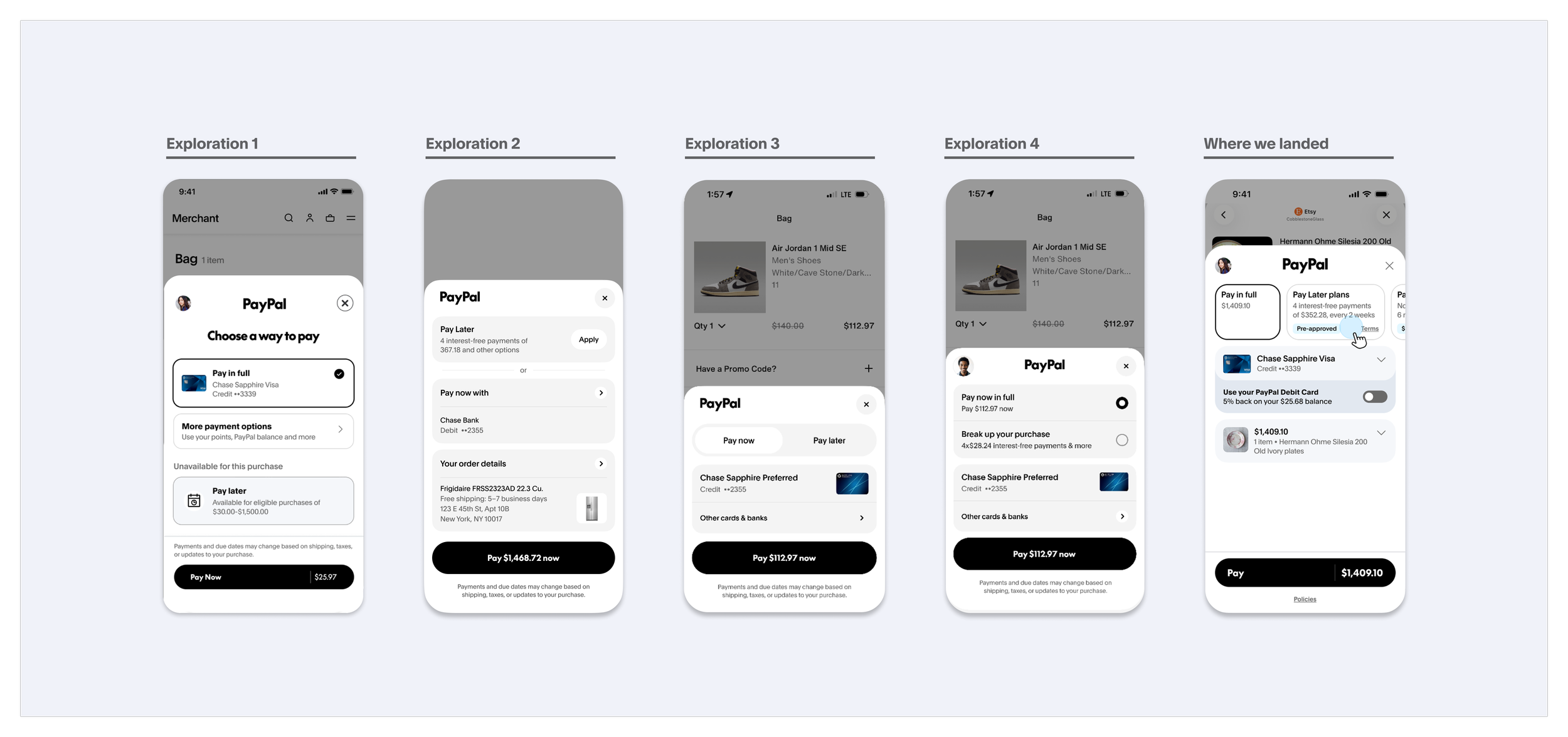
Explorations
After clicking on the button as a return member, I explored different bottom sheet variations of the paysheet to provide the reassurance customers needed before making a purpose and the control vs speed trade-off.
Return ‘vaulted’ button flow
I addressed this challenge by creating adding an additional step:
Instead of overloading the button, it now opens a bottom sheet before charging.
Return ‘vaulted’ button
With the traditional paysheet, it serves as a trusted signal and familiar experience. It’s cohesive with traditional checkout and condensed the various steps it needs to take to apply for pay in 4.
Business conversion isn't user confidence
Insight and learnings: Trust over speed.
Post purchase confidence
Dispute and return rate
Repeated usage
Agent to manual fallback
‘Instant Buy’ Vision
The foundational framework was trust over speed, every design decision prioritized user confidence over fewer steps. But the test data revealed a second opportunity: moving checkout upstream. Payment execution wasn’t the issue. Commitment was.
Instead of waiting for users to reach a payment step, we surface PayPal at the moment they're already considering a purchase. This isn't about skipping steps, it's about meeting shoppers where they already are, giving them the information and confidence to commit earlier. The checkout comes to the user, not the other way around.
Earn trust first, then evolve the experience.
I still believe inline is the future to solve for in-context checkout. Once we have more trust from users, figure out the technical constraints, we can provide a truly, in-context experience.
Additionally, since PayPal already has merchant catalog information, we can also expand PayPal’s agentic checkout capabilities by being a embedded shopping assistant to smaller 1st party merchants.